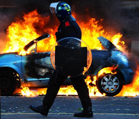
 There is an old story in London, and it goes like this. Following extensive rioting, there is an impassioned debate about the state of society with some saying it shows moral decay while others claim it demonstrates the desperation of poverty.
In 1886, London hosted one of its regular retellings when thousands of unemployed people trashed London’s West End during two days of violent disturbances.
In the weeks of consternation that followed, the press stumbled on the work of wealthy ship owner Charles Booth who had begun an unprecedented project – mapping poverty across the entire city.
He started the project because he thought Henry Hyndman was bullshitting.
Hyndman, a rather too earnest social campaigner, claimed that 1 in 4 Londoners lived in poverty, a figure Booth scoffed at as a gross exaggeration.
So Booth paid for an impressive team of researchers and sent to them out to interview officials who assessed families for compulsory schooling and he created a map, initially of the East End, and eventually as far west as Hammersmith, of every house and the social state of the families within it.
Each dwelling was classified into seven gradations – from “Wealthy; upper middle and upper classes” to “Lowest class; vicious, semi-criminal”. For the first time, deprivation could be seen etched into London’s social landscape.
I suspect that the term ‘vicious’ referred to its older meaning: ‘of given to vice’- rather than cruel. But what Booth created, for the first time and in exceptional detail, was a map of social environments.
The map is amazingly detailed. Literally, a house by house mapping of the whole of London.
The results showed that Hyndman was indeed wrong, but not in the direction Booth assumed. He found 1 in 3 Londoners lived below the poverty line.
If you know a bit about the capital today, you can see how many of the deprived areas from 1886 are still some of the most deprived in 2016.
So I was fascinated when I read about a new study that allows poverty to be mapped from the air, using machine learning to analyse satellite images Nigeria, Tanzania, Uganda, Malawi, and Rwanda.
But rather than pre-defining what counts as an image of a wealthy area (swimming pools perhaps?) compared to an impoverished one (unpaved roads maybe), they trained a neural network learn its own associations between image properties and income on an initial set of training data before trying it out on new data sets.
The neural network could explain up to 75% of the variation in the local economy.
Knowing both the extent and geography of poverty is massively important. It allows a macro view of something that manifests in very local ways, mapping it to street corners, housing blocks and small settlements.
It makes the vast forces of the economy, personal.
Link to Booth’s poverty map.
Link to Science reporting of satellite mapping study.
Standards for poverty are also pretty “relative”, and what might be considered ‘poor’ in say Appalachia, is almost ‘wealthy’ in some Third World areas.
I agree – plus in Appalachia we have a mix of rich & poor in the same area. There are 2 very large homes across from my house (which is a converted old store), but there are also several single & double wide trailer homes surrounding me. The spectrum of incomes & property worth is huge here.