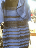
 The last time I almost went blind staring at “that dress” was thanks to Liz Hurley and on this occasion I find myself equally unsatisfied.
I’ll spare you the introduction about the amazing blue/black or white/gold dress. But what’s left me rather disappointed are the numerous ‘science of the dress’ articles that have appeared everywhere and say they’ve explained the effect through colour constancy.
Firstly, this doesn’t explain what we want to know – which is why people differ in their perceptions, and secondly, I don’t think colour constancy is a good explanation on its own.
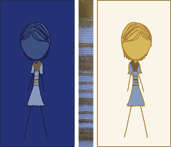
To explain a little, colour constancy is an effect of the human visual system where colours are perceived as being different depending on their context as the brain adjusts for things like assumed lighting and surroundings. Here’s a good and topical example from XKCD. The dress colours are the same in both pictures but the seem different because the background colour is different.
An important feature of the visual system is that the experience of colour is not a direct result of the wavelength of the light being emitted by the surface. The brain modifies the experiences to try and ensure that things appear the same colour in different lighting because if we just went off wavelength everything would wildly change colour as it moved through a world which is lit unevenly and has different colour light sources.
Visual illusions take advantange of this and there are plenty of examples where you can see that even completely physically identical colours can be perceived as markedly different shades if the image suggests one is in shadow and the other in direct light, for example.
Firstly, this isn’t an explanation of why people differ in perceiving the dress. In fact, all of the ‘science explanations’ have simply recounted how perceived colours can change but not the most important thing which is why people are having two stable but contradictory experiences.
Colour constancy works on everyone with normal colour vision. If you take the panels from the XKCD cartoon, people don’t markedly disagree about what the perceived colours are. The effect of each image is very reliable between individuals.
That’s not the case with the dress. Also, if you say context makes a difference, changing the surroundings of the dress should change the colours. It doesn’t.
Some have argued that individual assumptions about lighting in the picture are what’s making the difference. In other words, the context is the unconscious assumptions people make about lighting in the picture.
But if this is the case, this still isn’t an explanation because it doesn’t tell us why people have different assumptions. Psychologists called these top-down effects or, if we’re going to get Bayesian, perceptual priors.
75% of people in this BuzzFeed poll said they saw white/gold, 25% said they saw blue/black, and a small minority of people say they’ve seen the picture ‘flip’ between the two perceptions. How come?
And there’s actually a good test of the colour constancy or any other other ‘implicit interpretation’ explanation. You should be able to create images that alter the visual system’s assumptions and make perception of the dress reliably flip between white/gold and blue/black, as with the XKCD cartoon.
So, any vision scientists out there who can come up with a good explanation of why people differ in their perceptions? Psychophysicists, have I gone wildly off track?

 In a moving and defiant
 The British